
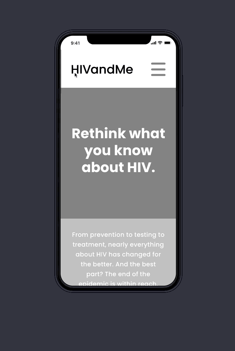
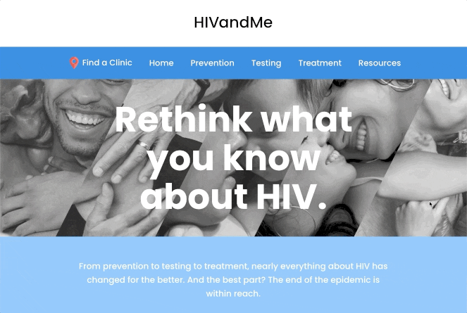
HIV and Me
Encouraging HIV education, testing, prevention and treatment in the community.
THE PROBLEM
Resources relating to HIV testing, prevention and treatment are prevalent in Utah, but stigma, shame and misunderstanding still surrounds the topic of HIV.
Our Question
How might we reduce shame and stigma and remove roadblocks to testing, prevention and medication access for HIV?
Stakeholders
The Utah Department of Health needed a user-friendly tool to provide accessibility to these resources across the state.
TIMELINE
4 months from research to final product delivery
MY ROLE
Lead Strategist
Lead Researcher
Lead UX Designer
Lead Visual Designer
KEY GOAL
Increase accessibility to HIV testing, treatment and prevention in Utah
MY ROLE
Project Scope
I led this project end-to-end from research and content strategy to UX and visual design.
6 User Interviews
4 Focus Groups
Quantitative Survey
Content Strategy
Personas
Empathy Maps
User Journeys
User Testing
Wireframes
Prototype
Iteration
High-Fidelity Design
Presentation to Health Department

USER RESEARCH
Three user groups emerged in the focus groups and were further explored through 6 in-depth user interviews and a quantitative survey.
-
Living with HIV
-
At-Risk
-
General Population
We identified common themes of shame, isolation, and frustration among those at-risk or living with HIV, and a lack of knowledge among the general population.
Affinity Mapping
I led the team through an affinity mapping exercise to brainstorm potential roadblocks our user groups might encounter in trying to get tested, get prevention or get treatment. We incorporated stakeholder input and qualitative user data and grouped our findings into categories to drive the content strategy.

DESIGN
PROCESS

Wireframes
I analyzed our research to extract insights, behaviors and emotional responses and develop empathy with our user’s needs, goals, and pain points. Using these insights I built personas, empathy maps, and user journey maps and designed wireframes and a working prototype to conduct user testing.


Prototype
User Testing
Using the prototype and the testing tool Maze, I undertook observational and virtual usability testing with participants in our user groups to determine any major usability issues.
I used this feedback to iterate and make changes to the wireframes before moving on to visual design.


5
observational task based user tests
17
virtual mission based user tests
73
usability score on Maze
What We Learned
1
Users were scrolling for too long before finding a CTA to lead them to complete the requested task.
Solution:
Add a CTA button on each page above the fold
2
Users do not always know to use the logo to navigate “home”.
Solution:
Add "Home" item to the main navigation
3
The treatment section was unclear to those unfamiliar with HIV.
Solution:
Re-organize the content and give the section a simplified header
TITLE OF THE CALLOUT BLOCK
Visual Design
Design System
Content Structure
Our users expressed a desire for the feeling of connection, easy to digest information, and a clear emphasis on the U=U message.
The color palette, friendly graphics, and human characters were part of a design system used to encourage a feeling of community and connection. The minimal design, clear hierarchy, and repeating elements to define section content on each page create an intuitive, easily digestible experience.
Stats on each page allow the user to quickly scan high level information, and content is organized to address the proven roadblocks of fear, cost and accessibility. The U=U message is repeated continuously across the site to promote its significance, and many additional resources are linked for users to learn more about the science behind the concept.
Results
Analytics
Insight
I worked closely with the engineering team to launch this project on schedule and ensure a quality deliverable.
The launch of the site garnered over 3k views in the first 3 days due to some unexpected PR. Post product-launch, we continued to evaluate the usability and refine the experience using a combination of analytics and behavioral monitoring with HotJar.
Our research also helped inform the SEO and Digital Media strategy by discovering where our users were spending their time, sources they trusted, and key words they might use.

